

Inspired by the original 1988 David Cronenberg film, Dead Ringers from creator and showrunner Alice Birch draws from the original storyline of twin gynecologists but reimagines the format through the Mantle twins who are on a mission to change the way women give birth.
Awards Radar had the opportunity to speak with Erin Magill, the Production Designer for the series starring Rachel Weisz about how she built the tone of the show utilizing iconography, architectural strategies, and color palettes to convey the eerie psychological mood. During our conversation, I also spoke with Erin about the spatial qualities of the primary locations in the series including the hospital and birthing center environments and how the real-life implications of these spaces weigh on the system of women’s healthcare today, a major component of commentary for Alice and the creators.
Magill also discusses her relationship to the source film and what aspects she hoped to pay homage to when developing the early vision against what aspects were going to be reimagined.


You can read the full interview with Erin below.
Danny Jarabek: Erin, how are you today? Thank you for joining me.
Erin Magill: Thanks so much for having me. I’m doing great.
So, of course, first of all, congratulations on this show. It is stunning visually and narratively, and just a super gripping television series so congratulations on your role in it. This series, of course, came from a film originally and I’d love to hear from you what your relationship was to that material and how that started to shape your vision for it in the early stages.
Erin: I had seen the original years ago, but to be honest, it had been a minute, but it had stuck with me, honestly, probably because of the Jeremy Irons performance, which is just phenomenal. So then, of course, I was very intrigued because I’ve been a fan of Rachel [Weisz] for forever and then received the scripts and was blown away with the kind of adaptation and rethinking that Alice had come up with. So once I was awarded the job, there was always going to be a bit of the original film that we wanted to pay homage to and remember. But I would say, if anything, it was that there’s definitely a moody darkness to it that lends to a bit of a psychological thriller. The other thing I think they actually do very well is it’s very grounded in a bit of this high society New York world that those doctors are in, which I think helps build attention even more because it seemed like it is more believable. You feel like this could happen to you. That was really something that I think I was trying to draw from overall from the film. Then, more so to our brilliant costume designer, Keri Langerman. There was the early discussions of those scrubs and the idea of red and when we would be incorporating that which influenced Keri’s work and then I followed with what I was going to do.

Yeah, absolutely. And I can say, too, of course, the original film coming from Cronenberg. I’m a big fan of Cronenberg myself and so I loved seeing this adaptation and the way that it was reimagined in so many ways, too. What about that reimagination from Alice and the other creators really stood out to you and drew you into the script from the beginning?
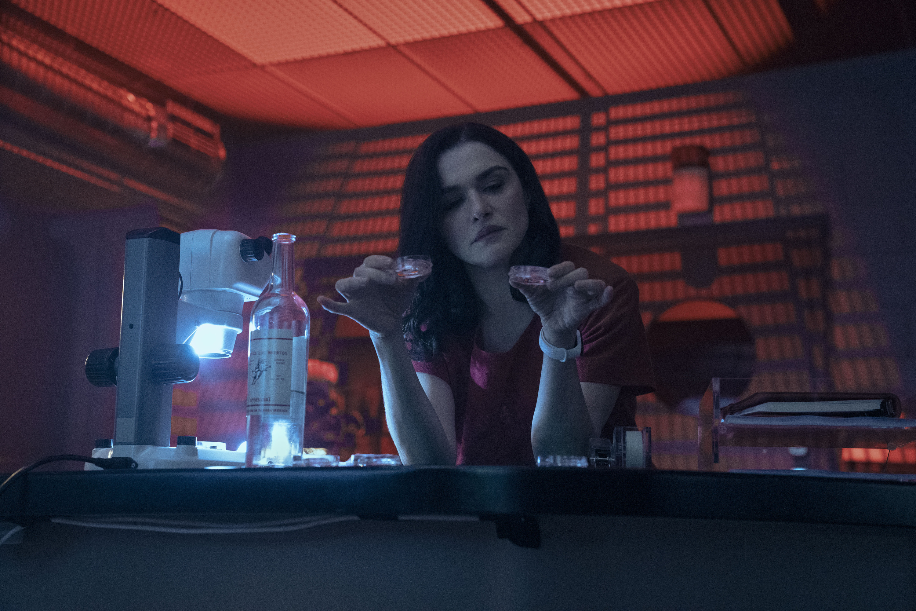
Erin: I think on a very basic level, just this idea that Rachel is a woman and it’s these two female gynecologists and this female perspective. Most of all the way that initially Alice really wanted to delve into women’s health care. Not only the way that it’s treated in America, but then also just the process itself. I think we’re all very familiar with a lot of the body horror imagery that comes from a Cronenberg film and what was super interesting to me was this idea that a lot of what we were going to be doing wasn’t crazy tools and disturbing shots of things happening. It was more, we’re just going to show you what actual birth looks like. I think those images alone, how shocking that apparently is to show, and how rare that is to see on TV. As a designer, I was very aware of that because I knew about the amount of blood from the very beginning, and that idea of her when she has the miscarriage in her bathroom and all of those things were written in. So it was something that I was very aware of with a lot of the textures and palettes that I was choosing because I knew that this idea of blood would be splattering on the floor, on someone’s hand, on a wall. I was always conscious of trying to pick that canvas and backdrop for the process of birth and how to help heighten and show that regarding what it looks like.

When I actually first started the series, I turned it on and I was just casually eating lunch at the time. And the first five minutes happened, and I was like, okay, we’re getting right into it. Maybe I’ll set the salad aside for a second.
Erin: We should have put a warning for that. I apologize.
No, I mean, I loved it. I was like, wow, okay, we’re right here. I loved that quality of it, how it just really is visceral from the first moment and I think the production design absolutely has a lot to do with that. What were some of your sources of inspiration for building the mood and tone of this? Because, as you said, it lends itself to that psychological thriller quality. It’s got this kind of eeriness to it that sort of sinks under your skin the whole time. Everything feels like it’s a little too dark than it’s supposed to be. How did you build that visually?
Erin: Well, I would say there’s a few big picture ideas. In conversations with Alice [Birch] and Sean Durkin and Jody [Lee Lipes]and Laura [Merians Goncalves] our DP’s that one idea going back to the original Cronenberg of New York and we’re in this psychological thriller. We did want to really ground it in this idea that we’re making a bit of commentary on the New York feeling of if you can make it here, you can make it anywhere. The idea of this city that never sleeps and that kinetic energy that I think is very apparent in the twins and especially also when you work in the medical field and clearly with their hours, it’s a bit of you don’t know what time it is. They’re working insane hours. Also with, as we learn, some of the habits of the twins and so all of that really, I’d say that chaotic energy was one part of what we were playing with overall for this series. The other that was really interesting to me was something that Alice had said that she was very interested in this idea of doctors in this kind of God complex. I think clearly with Beverly and more so, Elliot, there is a bit of that going on. So for me, that was played out with high ceilings and skylights and a lot of when you’d get those very dramatic shadows in certain pieces of art that we featured, within their home by this artist, Jesse Mockrin, her work is inspired by these old masters and certain pieces of stained glass and religious iconography and themes and textures which was something, again, that I was trying to play with overall throughout the show.
Something I would love to hear your perspective on, too, is that we open in episode one at what we presume is a pretty high level hospital in New York. And then later on we have the birthing center and there’s very different spatial qualities to these and even all the in between spaces as well, like the Parker house. But what is it about the hospital in particular and the way that people, these people working in the medical profession, utilize that space that you wanted to exploit or challenge or subvert in a way?
Erin: Yes, absolutely. Thank you. It was something we thought a great deal about because, of course, these twins, we meet them, we want you to understand they’re the best at what they do and they’ve worked their way to essentially something like the top position at a Lennox Hill or a Mount Sinai in New York, but within that, it’s still very much an old kind of antiquated system, a bit of a boys club. When you look truly into more of the architecture, a lot of those spaces, there’s a lot of politics involved in what areas of a hospital might get redone at certain points and they start to be very mazelike and confusing and claustrophobic. That was something that was really interesting to us in the design and the shape of the layout of the rooms for the patients, to the nurse’s, to the doctors, even their locker room. The fact these spaces would obviously be something that would be the least updated and there’s water marks on the ceiling in that space and this idea that a level of claustrophobia and the bureaucracy that the sisters are both simultaneously frustrated with and how I could help that with. It’s a maze structure with the lack of light, a certain palette. We tried to play a lot into the very gendered ideas that exist in a lot of these spaces. The very pale pinks and blues that go on, but also, a lot of vertical lines because again, for the idea that they’re a bit trapped in that world. Moving then to our birthing center we looked into what is out there, but then wanted to take it even further. This idea of a bespoke facility with our beautiful lobby that had those amazing walkways and staircases with that very bright skylight and very warm wood, warm marbles, and very organic wood feeling. This idea again, we really tried to lean into a lot of very warm textures and very feminine curve shapes for that kind of facility that felt very inviting and leaning into the idea of a very high end spa that you’re entering that I think a lot of these facilities try to go for now. Then taking that to Elliot’s lab, which was a part of it, which was a little more, we could play a little more into the heightened drama of it, because the idea of her lab was a little less publicly exposed, but still something that obviously they had quite a bit of financing to make this impressive center versus where we had first met them.
Right. I love talking about this too, because I’m actually a practicing architect by day. That’s why I love talking to production designers, because I feel like we speak the same language and so I love getting that insight on this show because I feel like that is so potent the feelings within these different spaces and how it’s reflected in the psyche of the show all along. An aspect I’d love to ask about too, is, was there a lot of consideration in your process with the production design with how you were going to coordinate or reflect the personalities of our two protagonists, who, of course, are both played by the same wonderful actress and portrayed in ways where you can feel the difference between them and their personalities? Was there an effort to reflect that as well in the production design?
Erin: Yeah, I would say the biggest would be in their apartment and their space. With the apartment itself, the goal was how do we reflect on a surface level the wealth and status they have gained through this Upper West Side apartment. But again, this is going to be emblematic of these two and their very codependent, toxic relationship. And so, on one hand, that’s why I’d say there are more communal spaces, the kitchen, the living room, that entry, that was a reason for it being very open and this idea of lack of walls and borders. It’s also very sterile because there was a bit of inspiration coming from this idea that they’re most comfortable at the hospital. And so, something that, again, in this very clean, slick environment, I don’t think either of them are too sentimental that it wasn’t going to have walls covered with knickknacks of history and family like that. But then their bedrooms and talking with Alice, our creator/showrunner, it was like that might be the one place where each of their personalities shine a little more. So, Beverly’s being more reflective of her more calm demeanor, her more well behaved manner. For her, it was really a sanctuary. We really used a lot of calming blues and you’d say almost a Turrell-inspired light/calming thing above the fireplace. Some of our windows were a little bit church-like and that this is really a sanctuary for her where she goes to decompress at the end of a stressful day. Whereas Elliot, who obviously is the much more vivacious twin. It’s interesting because when we designed it, it was like here’s this beautiful space that they probably hired someone to do. But then the idea would be that Elliot probably came in like a tornado and immediately put up the TV on the wall somewhere that would have made the interior designer have a panic attack haphazardly where she wanted it. There’s piles everywhere and there’s leftover food and she’s a bit of a mess. Therefore, I think there’s that layer that she’s adding, but the bones that we started with, I think in general, we liked the idea again, that she’s got these more vibrant, saturated colors playing a bit with the red and a darker green, Hunter green.Then this wallpaper we used was this beautiful mustard wallpaper that was based on a Van Gogh painting that I thought was just very kismet and made sense in this interesting way to me. There’s also a lot of textures playing off one another through her very erratic behavior. Finally, we give them a bathroom to share in between where they have this space that is completely emblematic of their codependent relationship with everything the open showers, open toilets, open doors to see through to one another and that’s very much their relationship.
Yeah, 100%. Well, thank you so much for your time, Erin. I really enjoyed getting to hear your insight on this show. And congratulations again. I think it’s a visually and narratively stunning piece of work, and it all came together really quite brilliantly. So, thank you so much for your perspective, and I hope you have a great rest of your day and thank you again for your time.
Erin: Thank you so much. I appreciate it.
This interview has been edited for clarity and brevity.


Comments
Loading…